Showing posts with label decor. Show all posts

Friday, February 14, 2014

Perche, Paris - Île-de-France


Gina: Well, Tina did it again. She's so good at finding homes that are on the market abroad and stateside that could use our loving touch. When she sent Perche to me I said, “I get my stone cottage!”.. she spoils me. Rotten. 

Here are the exterior "before" photos.. 


We went straight for the grey stone veneer that just makes me giddy with glee, the whole cottage will be covered in stone. It gives the cottage such a warm old world feel that just looks perfect in the middle of the woods. With little pops of browns, tans and pink.. this stone just lifts my spirit. All doors and trim will be painted in Vin Rouge, it's only fitting for a cottage in France, right? The color pairs with the veneer for such a simple but powerful statement of charm and sophistication. 

The roof shingles will be replaced with a more modern shake shingle, a lifetime metal shingle with a classic look and very little to no upkeep down the road. We'd remove the seat walls that are placed out front and instead use long planters that have an antiqued look, filled with beautiful flowers that add a welcoming look to the entry. The tree needs work, but with some extra love and perhaps smaller planters bursting with flowers surrounding it, it too can have another chance to make a pretty statement. 


The rear view of this home is missing one gigantic item.. a sitting deck. It has all of the room for comfort just sitting there, waiting. Couldn't you just imagine lounging on that deck, sipping a glass of wine at the end of a long day? I could. This deck adds tons of value to the home and a big selling point for the future. Replacing the stairs and adding a deck would be my top priority. 

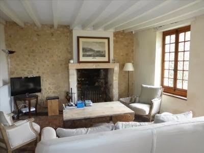
Here are the interior "before" photos:


Tina: Soft pinks makes the rooms feel romantic, while the greys keep it from feeling too fussy. I was looking for pieces that felt chic and modern in an old fashion way. If you know what I mean. ((haha)) I wanted to update the vintage feeling while keeping the look a bit cleaner. In the living room, I featured an abstract painting above the mantel to mix in with the worn wood tables and the traditional Chesterfield sofa in linen. 


The touches of soft pink are very little in the room, but by spreading it out it felt more like it had a starting role. The theme went on into the dinning room, where old met new. 


The sleek met worn. I pictured a couple collecting pieces through out their relationship, going to fleamarkets together and mixing and matching. 

Finally the bedroom! How about that bed? I didn't want that fuss factor to come up , so I mixed in a modern light fixer and to top it off a sketch by 60's fashion designer Bobby Hillson. 


After all this is France the fashion capital of the world. I can picture myself moving in tomorrow. 

>> Here's a little extra.. we couldn't resist a little girl's room in this perfect, romantic country cottage in France! <<


Thursday, February 13, 2014

An Arizona Hacienda

Gina's input: At first we looked at the space and what was in it and went Southwestern, a more modern and soft take on a Southwestern space.

Color – We both feel that color is the most important element in a space, but we also both agree that the walls shouldn't be the focal point. Rather, the starting point and also what ties the whole design together. So originally I picked wall color in the linen family, I wanted the walls not to scream but instead blend because of all of the dark colors that are already in the space. The floors are a dark clay color and the hallway leading into the room has Saltillo tile as a wainscot halfway up the wall as a detail. That makes for a dark room to begin with. So, my first thought was to lift the room. We both felt the need to use blues in this space, all of the colors used traditionally in Southwestern design are very warm colors like reds, burnt oranges, bright yellows and browns. We were pretty set on bringing in the blues. Here is the original board that Tina put together. I'm not a huge fan of Southwestern, but I really loved the pieces! 


We kind of have a tendency to get excited and can't wait to imagine the space and all of the elements that will fill it. We had to wait to see what she actually wanted to do with the space, and that ended up being more Hacienda than Southwestern.. those really are very different design attitudes.

Hacienda has more of a Spanish/Mediterranean vibe to it.. and in Arizona LOUD colors. Here is the color palette we were given to work with. 


Again, as two individuals who aren't as keen as others on Southwestern or Hacienda design, we really had fun designing this room with a tasteful and warm Hacienda flare.

We had to start all over. The client wanted lots of color and definitely not linen toned walls. We stared long and hard at the palette and decided that yellow was the right answer for the space. It can be loud but also carry a sophisticated elegance with it. We still wanted the walls to be soft compared to the rest of the elements in the room.. this shade really was our starting point. Tina found some throw pillows that further inspired, they have a vibrant quality that began to set the tone for the room. Hacienda is known to be very loud, so we needed elements that worked well together rather than fight, or even worse, elements that might just blend in to each other.


Our next search was draperies, they needed to have lots of personality but also enough balance to bring the room together. We had an idea of what we were looking for and Tina did want she does best.. she narrowed down the search and found the perfect look.


Tina's input: We wanted to give the client a space where many generations of family could gather and use the room. It needed to be bright and cheery with lots of color, but was good on wear and tear. So, I searched for pillows made from old Mexican blanket and leather sofas that were already distressed so they would only get better over time. This needed to be a room where the families new grandson could sit and not worry and doing damage to the furniture.

As Gina said we made the walls a soft yellow color. After all this color in the walls , pillows and such. I really wanted a visual break. So the draperies although colorful, had a white back ground. That bit of white can keep a room from feeling heavy and over worked. Finally the last stage is filling the room with the home owners personal art and items. 


This makes a room fill like it really belongs to them. Their own personal get away.